live
04
Typography
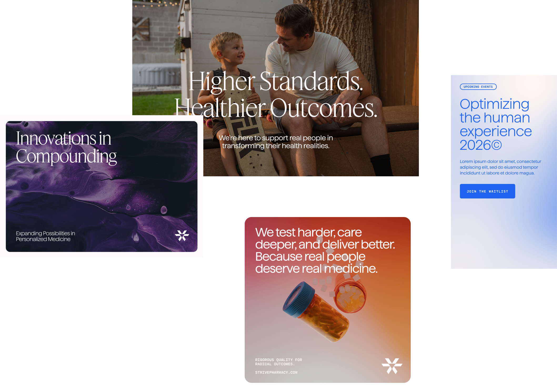
Typography is the voice of the Strive brand on the page. Our type system pairs a timeless serif with a warm sans-serif and a sharp monospace—each playing a distinct role in creating communications that feel human, credible, and unmistakably ours.
Feature DisplayLight
Feature Display is a serif typeface with timeless flair. Its humanist style adds an approachable but credible dimension to our Visual System. Feature Display is used for all primary headlines and accented body copy.
Haffer XH:
Light,Regular,
Semibold
Haffer XH is a contrasting sans-serif typeface with a warm and friendly tonality. Haffer XH is our workhorse typeface used for body copy, subheads, and tertiary information.
Cartograph CF Bold
Cartograph CF is the tertiary typeface and used in limited ways such as eyebrows, labels, and buttons.
Typography System
Our type system is intentionally restrained. Use as few styles as necessary to communicate clearly, and always prioritize readability over decoration. Range type to the left, pay close attention to the rag, and avoid orphans and widows.
Typography Alignment
Left-aligned type is our default. It creates a clean, natural reading rhythm that feels approachable and confident—two things Strive always is. Reserve center or right alignment for specific design moments, never as a default.